
Why You Should Always Have Your Website Reviewed Before Going Live

Every now and again, I will come across a website that even I feel dumb trying to navigate. They’re usually sites that are made by individuals that are primarily graphic designers. This isn’t to bash those individuals. This is to break down the importance of having someone else review your website before going live.
Graphic designers are creatives, most of them know how to think creatively, not logically. They’re always going to think of the most creative way to present something. That is completely fine, so as long as basic functionality is implemented. I know only a very few graphic designers that can also think like the average consumer. I’m going to show examples below and explain myself further.

This photo above is an example of what one website I viewed looked like. The issue here right away is the menu. It is spread out in four corners. You have the physically move your eyes to each corner to read everything. Instead we should aim to have all of the menu items in the same location for ease of readability and use. I got over this quickly, whatever, it’s design, is what I thought to myself. Then I discovered that the page moves left and right, rather than up and down like majority of websites. There were no indicators on the website to show that there was more content if you swipe on the page. People are missing information on your home page. Instead viewers will just click on one of the tabs.

Had there been some sort of scroll bar like I show in red, it would give an indication that you can scroll left and right for more content. It could have just even been small arrows. You need something or most of your viewers are not going to know that there is more to view on the page. I started clicking around to view more of the website and this is what happened next.
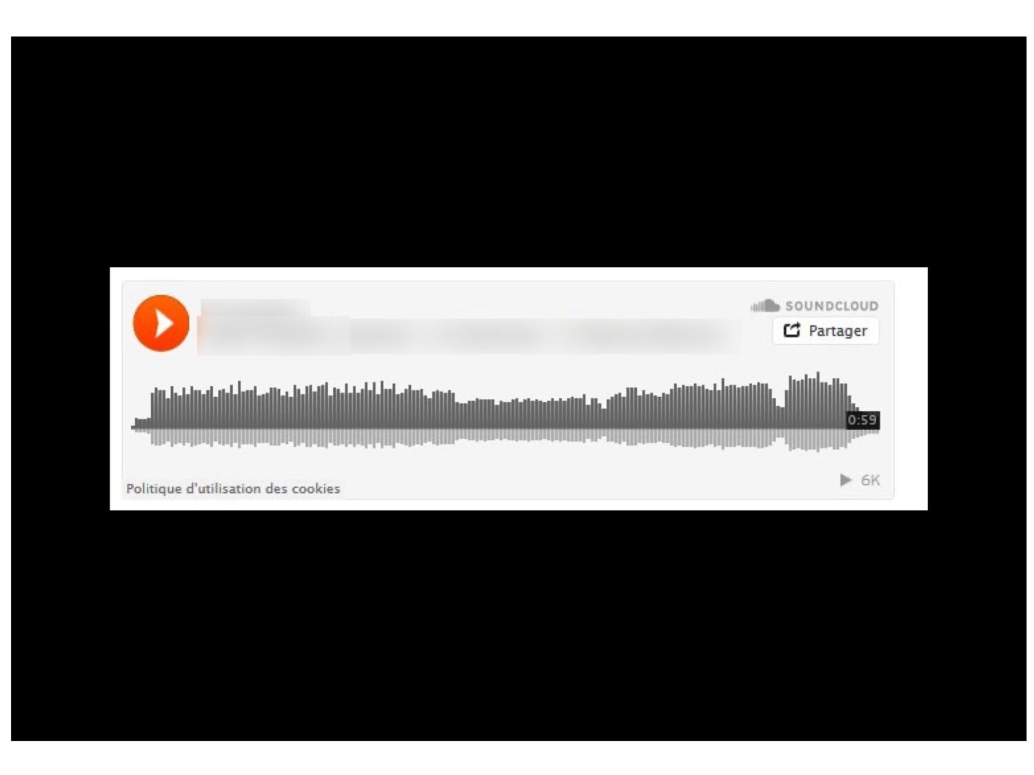
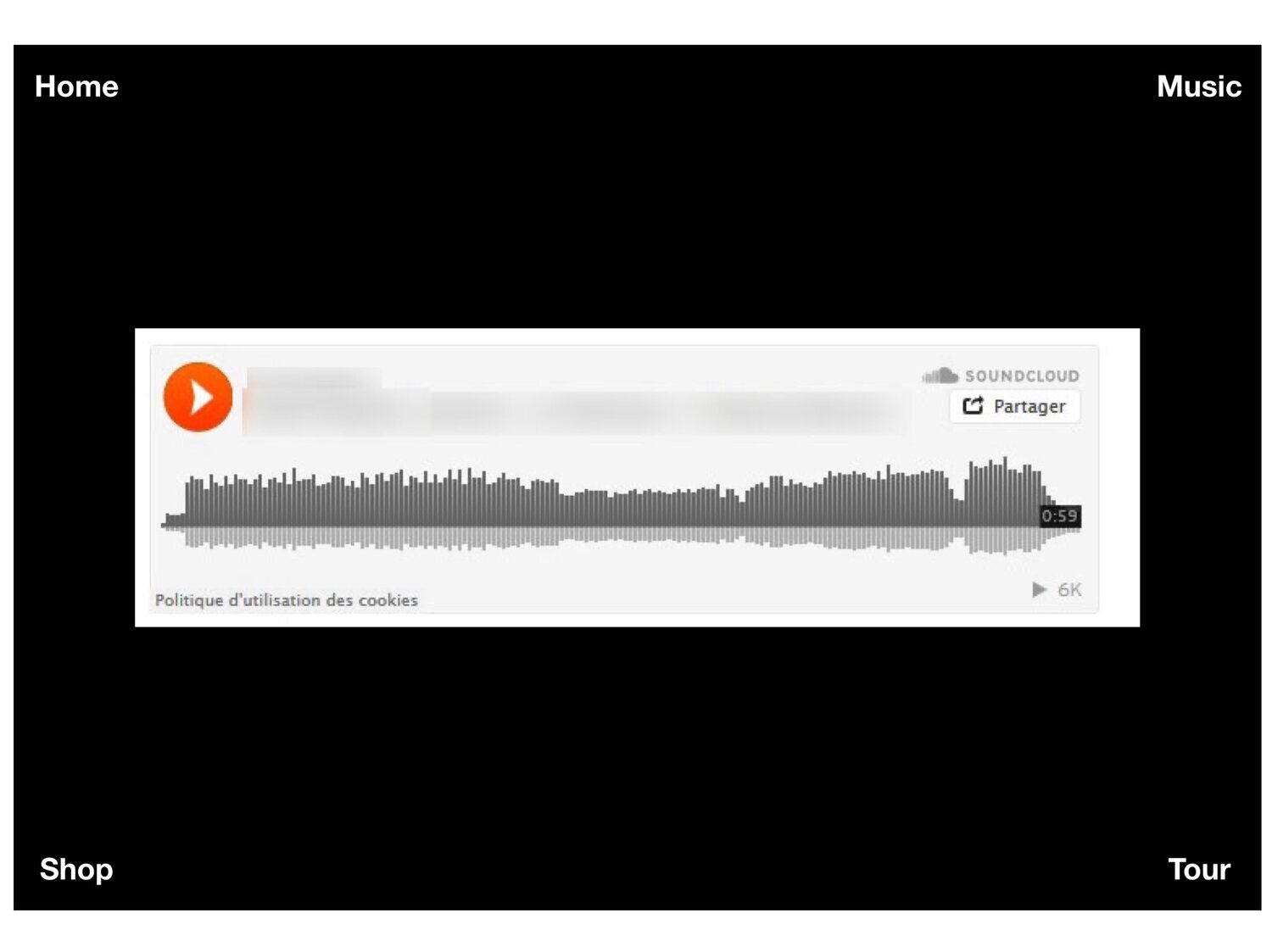
I clicked on the music tab and this is what I was presented with. A page with SoundCloud embedding which is fine, but notice how the menu options in all four corners have disappeared. That’s because the designer made this pages background black and forgot to code the menu colors to change to white when on this specific page. So, now the average viewer isn’t going to know what to do. They are essentially stuck on this page and there is a high possibility of them just exiting the website. I knew what the issue was, so I clicked in the corners and was able to find myself back on a page where I could see everything, but most people wont know to do that and will just exit, without even looking at your Shop and Tour pages. That equals potential revenue lost. Below is what the page should have looked like.
A person that isn’t solely a graphic designer or can switch on and off their designer and think like a consumer switch would have picked up on this mistake. They also would have recommended everything I have mentioned so far.
Moral of my story, don’t rely solely on your graphic designer, they think creatively. You have to have someone look at your website that knows how the average user is going to interact with it. Usually a web designer and marketing/branding person can easily decipher if a website will be user friendly or not. This prevents potential loss in revenue and frustration of use. Now that you’ve read this blog post, even you could review your website and pick up on things that need to be altered before making your website live.
Related Post: What Platform Is Better, Shopify or Squarespace For Your Website and E-Commerce Needs.